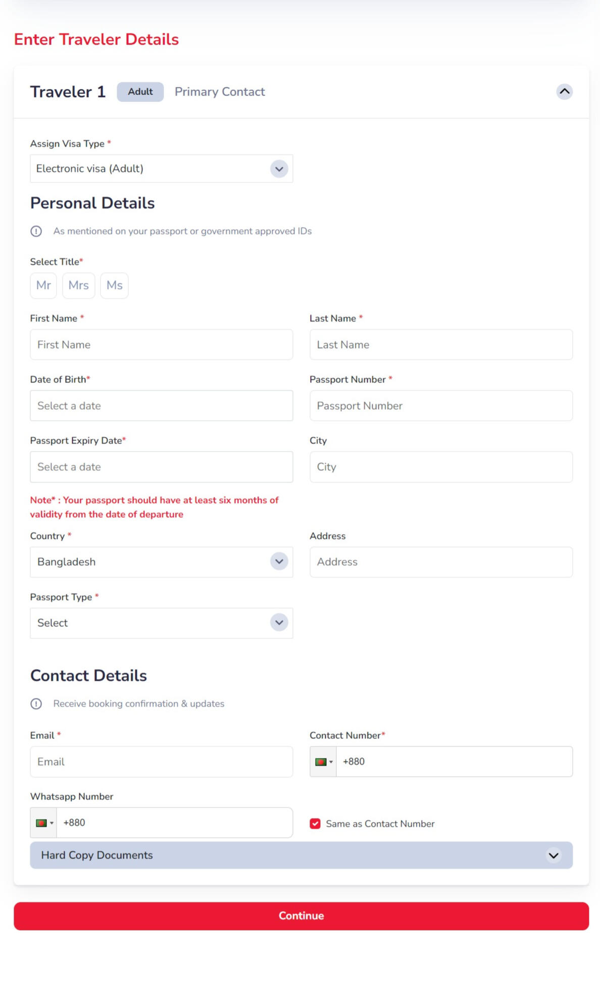
Web application Redesign: "Flight Expert" Trip Search and Booking
Flight Expert is a leading online travel agency in Bangladesh, founded in March 2017. It offers a wide range of services, including flight bookings, hotel reservations, and exclusive travel packages. With affiliations to over 500 airlines and 900,000 hotels worldwide, it provides a convenient platform for travelers. Known for its affordable and diverse travel options, Flight Expert caters to various budgets and operates primarily through its online portal. Additionally, the company offers a B2B platform, allowing other businesses to book flights and accommodations. In 2021, Flight Expert was acquired by Evaly, following significant growth and an expanding customer base.
The Project and Background
Being one of the most respected online travel booking services in Bangladesh, the Agency faced a number of challenges despite its established reputation. The flight booking service, central to its business, was causing user dissatisfaction, impacting engagement and conversion rates.The objective of this project was to redesign the Flight Expert platform, making it more intuitive, visually appealing, and user-friendly to meet evolving customer expectations.
My role
I was brought on as a freelance web UX/UI designer for this project through a referral, working remotely in collaboration with Flight Expert's in-house design and development teams.My role was to completely redefine and reshape the user experience, starting from research and extending to the final visual designs. I began by analyzing data and statistics provided by Flight Expert, conducting user research, interviews, and usability testing. The key findings were:Information Architecture: Needed reorganization for better accessibility.
User Journeys: Required enhancement to offer a smoother, more intuitive experience.
Design Elements: Needed user-centered design principles for cards and filters.
Transparency: Service information needed to be clearer and more detailed.
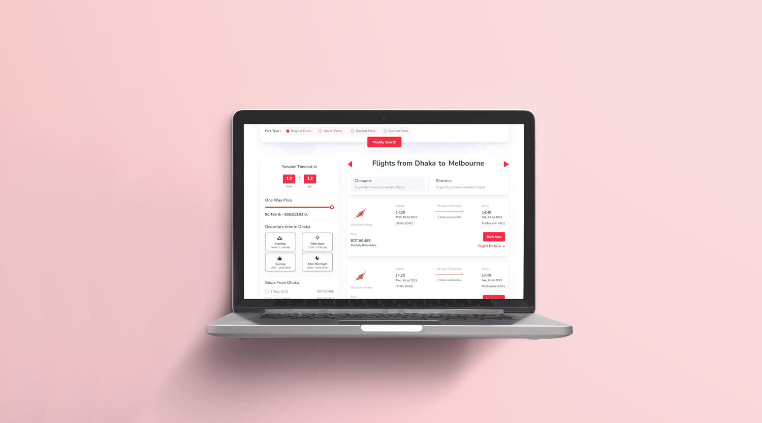
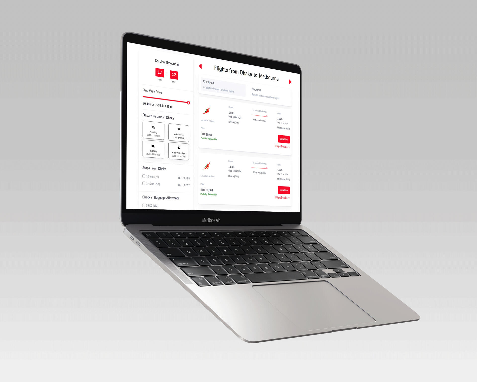
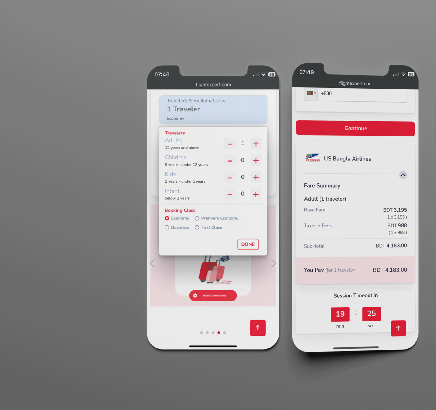
Session Timer: Essential to inform users of the session duration to avoid timeouts during booking.
After gathering these insights, I worked on creating a design system, building wireframes, designing the interface, creating prototypes, and finally handing over the assets to the development team.
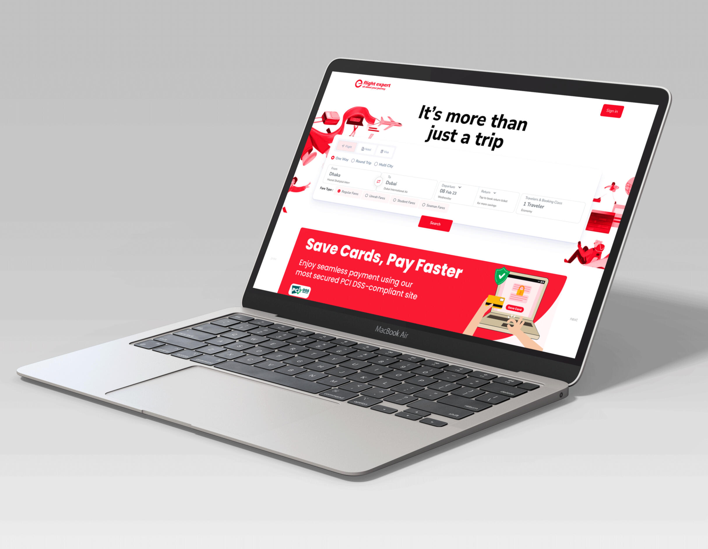
Methods and Technology
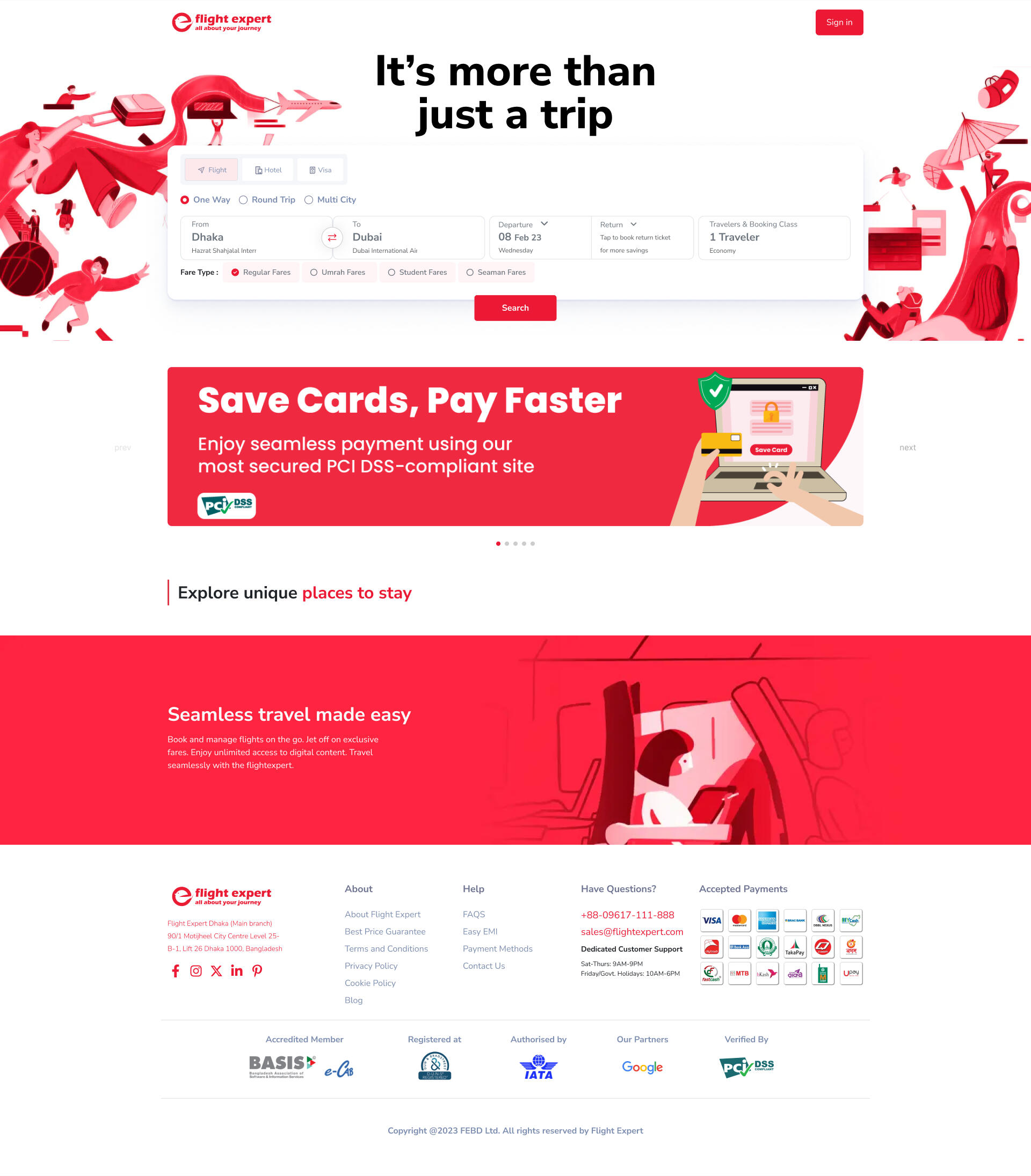
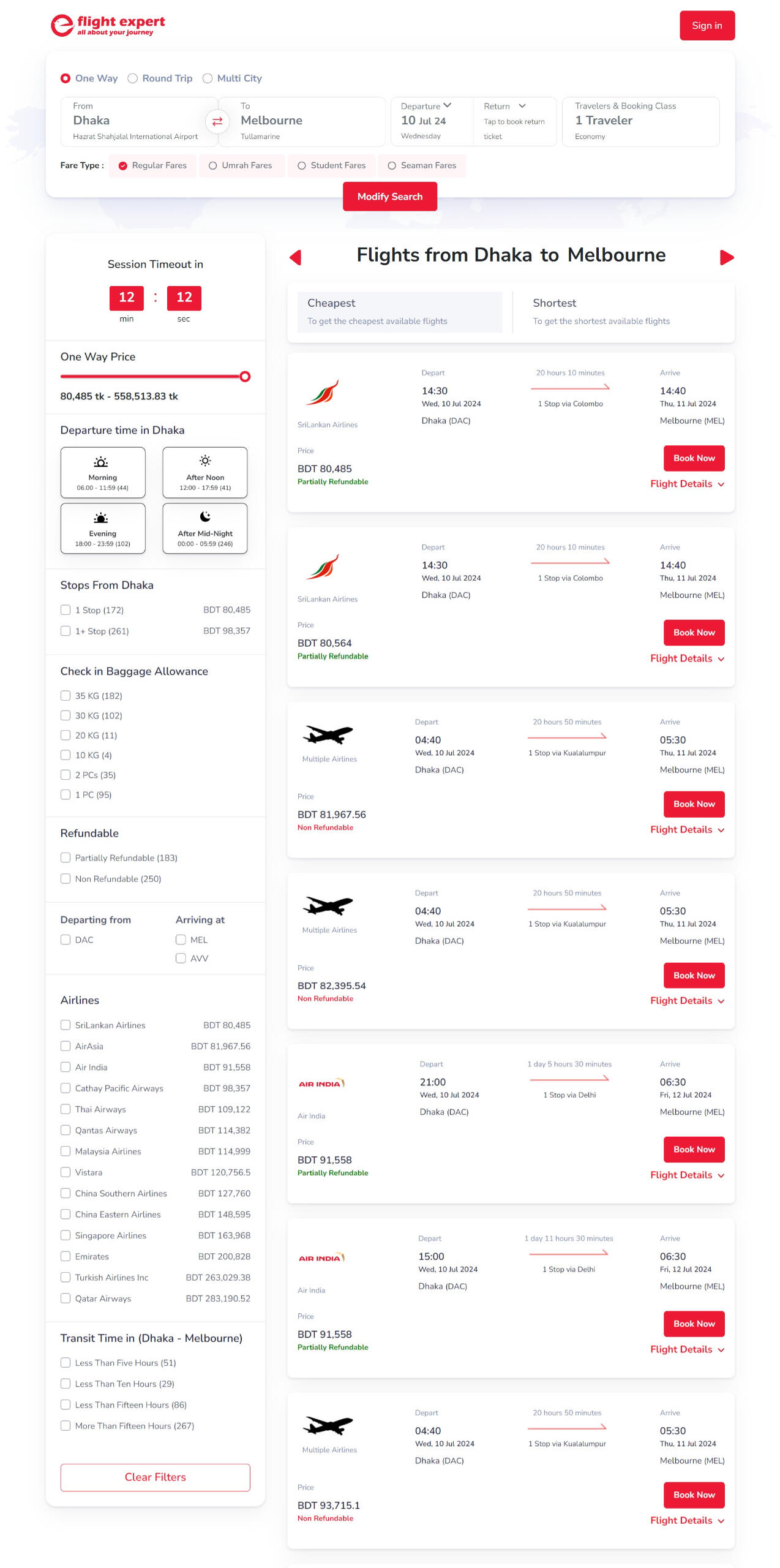
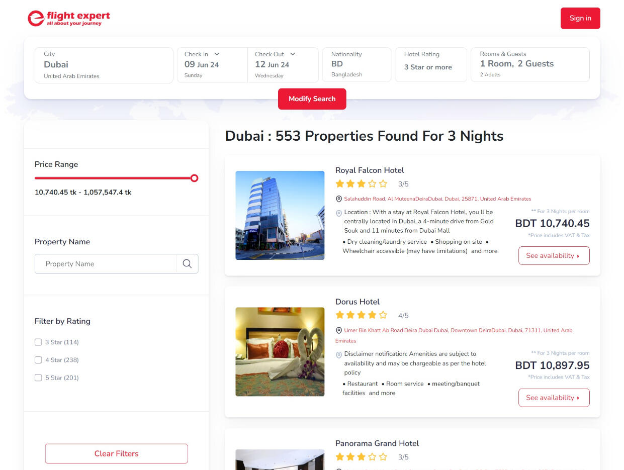
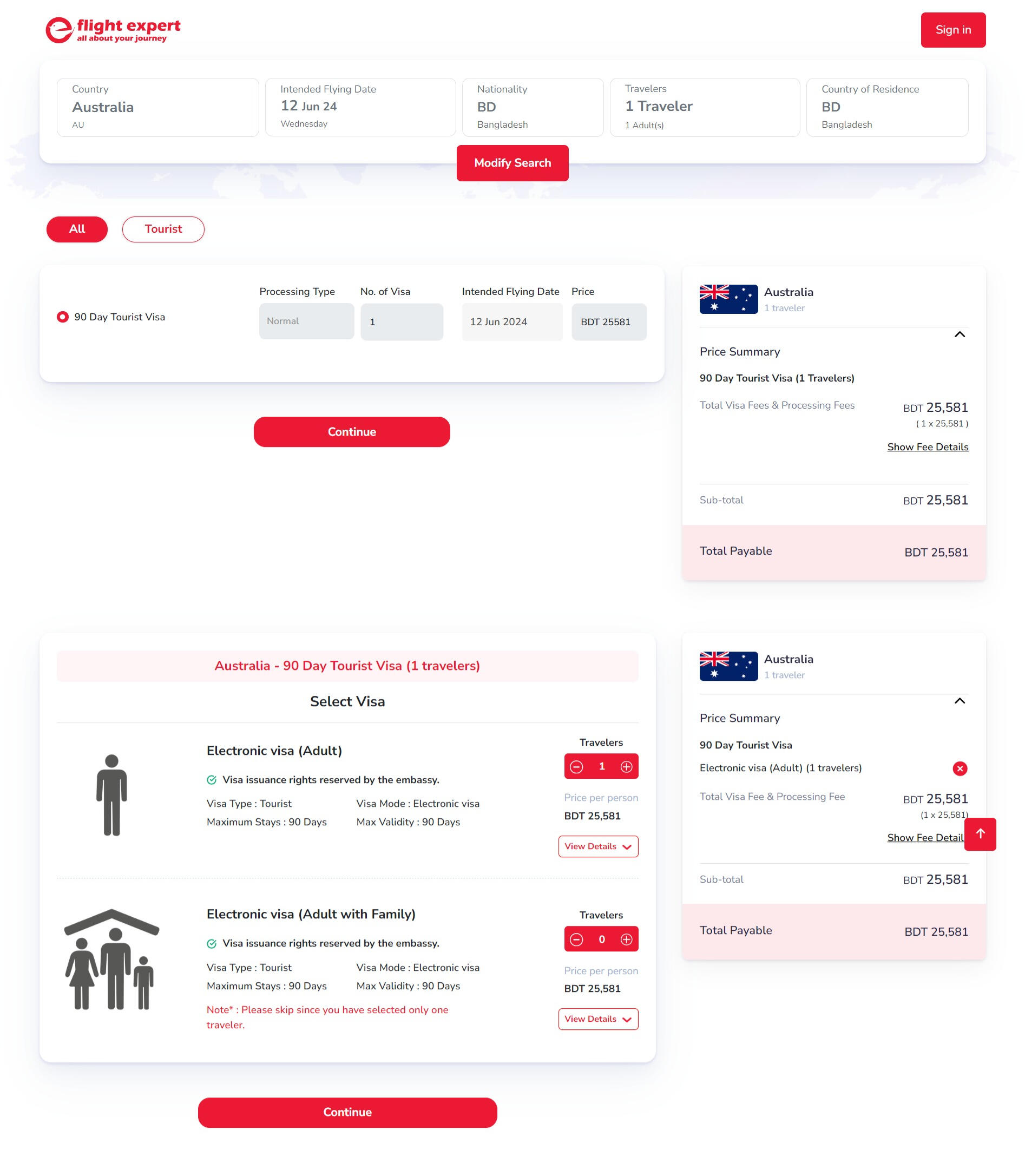
Interviews were conducted using tools like Microsoft Teams. Given that the majority of users preferred browsing the site on mobile, I adopted a mobile-first and agile design approach. I broke the design process into several phases, starting with ideation, storyboarding, and mapping out the user journey.Once the conceptual phase was complete, I created the design system in Adobe Illustrator and transitioned to Figma for wireframing, layout creation, and final design work. Web banners and images were edited using Figma as well.The design process was iterative, focusing on individual elements like cards, filters, and banners. This step-by-step approach allowed us to save time and easily make small adjustments as needed. I then designed the core pages, such as the homepage with three main sections: Flights, Hotels, and Visas. Following the user journey roadmap, I worked on the search results, selection process, booking form, and payment system. This approach was replicated for the remaining pages.Both mobile and desktop versions of the site were designed and subjected to A/B testing. Prototyping was done in Figma, and I later collaborated with the team on HTML and WordPress implementation using Divi. The site was made responsive for tablets as well.A full UX case study can be found here.


Let's Connect!
Feel free to reach out to me if you're interested in discussing potential employment opportunities.
Webanwendungs-Redesign: „Flight Expert“ Reise-Suche und Buchung
Flight Expert ist eine führende Online-Reiseagentur in Bangladesch, gegründet im März 2017. Das Unternehmen bietet eine breite Palette von Dienstleistungen an, darunter Flugbuchungen, Hotelreservierungen und exklusive Reisepakete. Mit mehr als 500 Partner-Fluggesellschaften und 900.000 Hotels weltweit ist es eine bequeme Plattform für Reisende. Bekannt für seine erschwinglichen und vielfältigen Reiseoptionen, bedient Flight Expert unterschiedliche Budgets und operiert hauptsächlich über sein Online-Portal. Zusätzlich bietet das Unternehmen eine B2B-Plattform, über die andere Unternehmen Flüge und Unterkünfte buchen können. Aufgrund des stetigen Wachstums und der wachsenden Kundenbasis wurde Flight Expert im Jahr 2021 von Evaly übernommen.
Das Projekt und der Hintergrund
Als einer der angesehensten Online-Reisebuchungsdienste in Bangladesch, die Agentur stand trotz seines etablierten Rufs vor einer Reihe von Herausforderungen. Besonders der Flugbuchungsdienst, ein zentraler Bestandteil des Geschäfts, führte zu Unzufriedenheit bei den Nutzern, was sich negativ auf die Benutzerbindung und die Konversionsrate auswirkte.Ziel des Projekts war es, Flight Expert in eine intuitive, visuell ansprechende und benutzerfreundliche Plattform zu verwandeln, die den sich wandelnden Anforderungen der Kunden gerecht wird.
Lösungen und meine Rolle
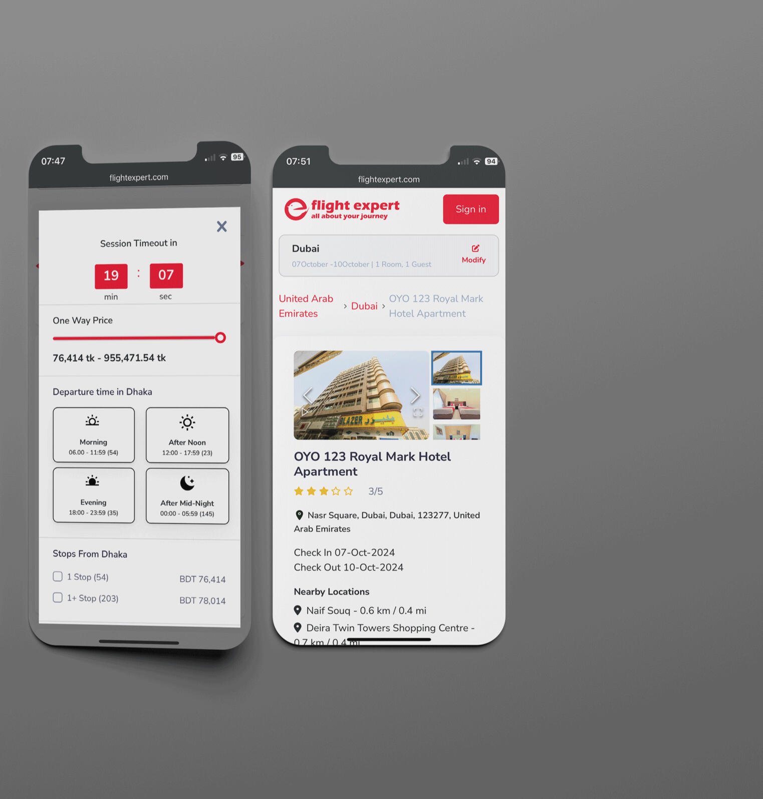
Ich wurde als freiberuflicher UX/UI-Designer für dieses Projekt durch eine Empfehlung engagiert und arbeitete remote, in enger Zusammenarbeit mit den internen Design- und Entwicklungsteams von Flight Expert.Meine Aufgabe bestand darin, die Benutzererfahrung vollständig neu zu definieren und zu gestalten. Ausgangspunkt war eine gründliche Recherche basierend auf den Daten und Statistiken, die mir von Flight Expert zur Verfügung gestellt wurden. Durch Benutzerbefragungen, Interviews und Tests identifizierte ich die folgenden Verbesserungsbereiche:Informationsarchitektur: Musste für eine bessere Zugänglichkeit neu strukturiert werden.User Journey: Mussten verbessert werden, um eine reibungslosere und intuitivere Erfahrung zu bieten.Designelemente: Mussten benutzerzentrierte Prinzipien für Karten und Filter übernehmen.Transparenz: Detaillierte Informationen zu den Dienstleistungen mussten klarer und umfassender gestaltet werden.Sitzungstimer: War notwendig, um die Benutzer über die verbleibende Zeit für eine Buchung zu informieren und Sitzungsabbrüche zu vermeiden.Nach der Analyse dieser Erkenntnisse begann ich mit dem Aufbau eines Designsystems, der Erstellung von Wireframes, dem Design des Interfaces, der Prototyp-Erstellung und der finalen Übergabe der Assets an das Entwicklungsteam.

Methoden und Technologie
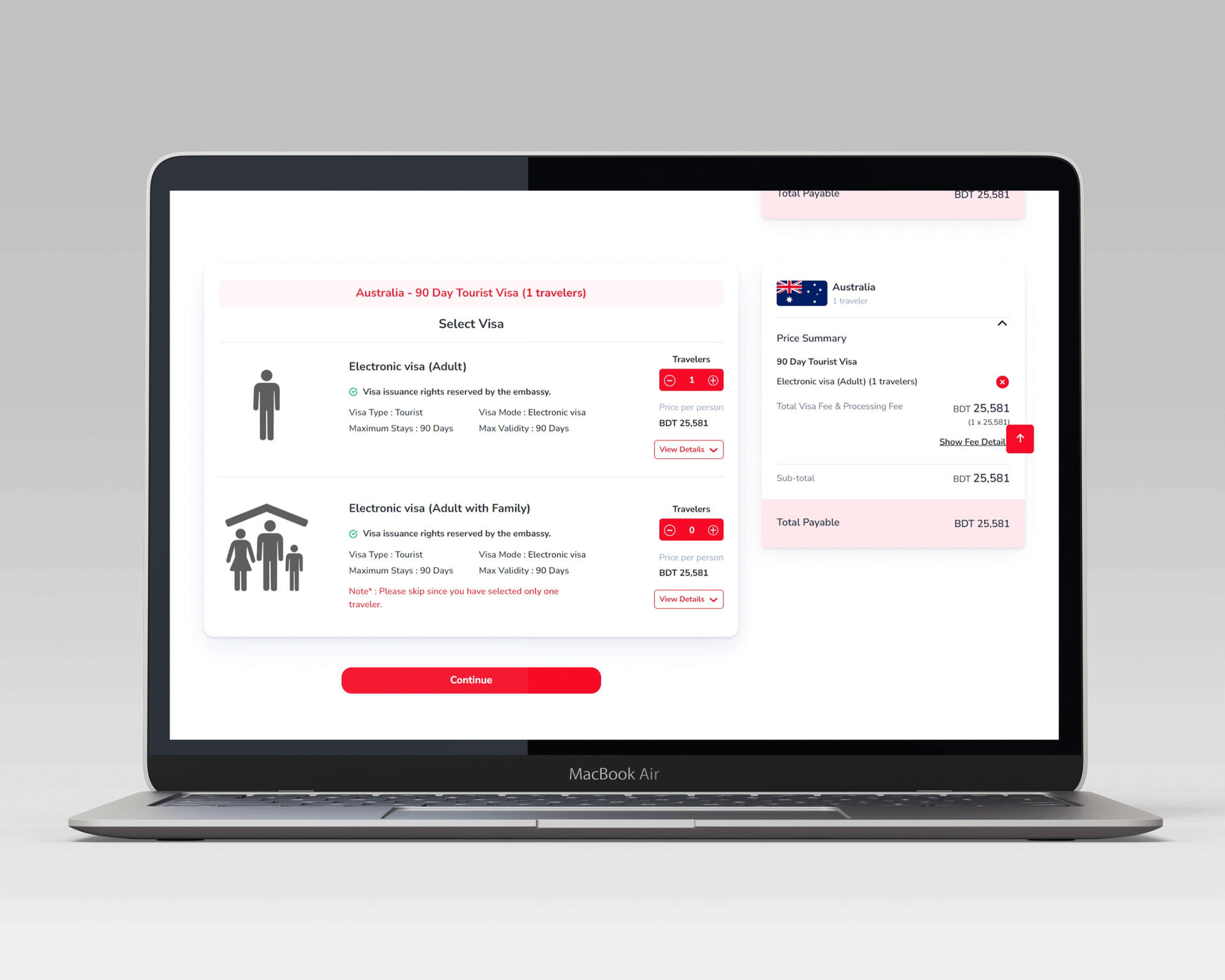
Für die Interviews wurden Tools wie Microsoft Teams verwendet. Da die Mehrheit der Nutzer die Seite bevorzugt auf mobilen Geräten besucht, habe ich einen Mobile-First- und agilen Designansatz gewählt. Der Designprozess wurde in mehrere Phasen unterteilt, beginnend mit der Ideenfindung, dem Storyboarding und der Benutzerreise.Nach Abschluss der Konzeption habe ich das Designsystem in Adobe Illustrator erstellt und bin anschließend zu Figma gewechselt, um Wireframes, Layouts und das endgültige Design zu erstellen. Webbanner und Bilder wurden ebenfalls in Figma bearbeitet.Der Designprozess war schrittweise aufgebaut, wobei einzelne Elemente wie Karten, Filter und Banner nacheinander gestaltet wurden. Dadurch konnten wir Zeit sparen und Änderungen an kleinen Details leichter vornehmen. Anschließend gestaltete ich die Kernseiten, wie z.B. die Startseite, die in drei Hauptabschnitte unterteilt war: Flüge, Hotels und Visa. Anhand der zuvor erstellten Benutzerreise habe ich mich durch die Suchergebnisse, den Auswahlprozess, das Buchungsformular und das Zahlungssystem gearbeitet. Diese Vorgehensweise wurde auf alle weiteren Seiten übertragen.Sowohl für die mobile als auch für die Desktop-Version wurden A/B-Tests durchgeführt. Das Prototyping erfolgte in Figma, und ich arbeitete später mit dem Team an der HTML-Implementierung und der WordPress-Umsetzung mit Divi. Die Website wurde später auch für Tablets responsiv gemacht.Eine vollständige UX-Fallstudie finden Sie hier


Let's Connect!
Nehmen Sie Kontakt auf, wenn Ihnen mein Portfolio gefällt und Sie feedback haben oder einfach nur Hallo zu sagen.
Redesigning the "Flight Expert" Trip Search and Booking Experience
Project overview
Project Title: Redesigning Trip Search and Booking Experience for Flight ExpertRole:
UX/UI DesignerDuration: 12 weeksTools Used: Adobe Illustrator (wireframing), Photoshop, Adobe XDTeam:
- UX/UI Designer (Freelance, remote)
- One In-house Designer – Sayem (handled payment method design based on my design system)
- One In-house Front-End Developer - Masud
The Challenge
Flight Expert, a pioneering online trip booking service in Bangladesh, faced a growing number of customer complaints, particularly with their flight booking service, which was crucial to their business. Customers were frustrated with the platform’s lack of transparency, non-intuitive navigation, and frequent session timeouts, among other issues. This dissatisfaction was impacting user engagement and the overall conversion rate.The task: To transform Flight Expert into an intuitive, visually appealing, and accessible platform that would meet users' needs and expectations.
Setting the Scene
Withe the provided user feedback and competitive insights by flight Expert, we set out to uncover the root of the problems. It was evident from user surveys and interviews gathered from 50 users that:- Transparency Issues: 69% of users found flight information confusing, particularly regarding timing and duration.
- Non-intuitive Navigation: 62% of users struggled with site navigation, indicating a need for a more straightforward layout.
- Visual Appeal: 38% of users felt the site lacked visual appeal, making it less engaging.
- Session Timeouts: 47% of users experienced frustration with session timeouts before completing their bookings.
- Tedious Booking Process: 37% found the booking process cumbersome and repetitive.
- Accessibility: 46% reported issues with accessibility, highlighting the need for an inclusive design approach.
Objectives
Our mission was to tackle these pain points head-on. We aimed to:
1. Enhance the platform's intuitiveness and accessibility.
2. Improve the transparency of flight information.
3. Elevate the visual appeal of the site.
4. Streamline the booking process for a seamless user experience.
Diving into Research
Competitive Analysis
Our competitive analysis of leading travel platforms like Expedia, Kayak and AirAsia revealed industry best practices. We identified features that enhanced user experience, such as clear information presentation, user-friendly navigation, and visually appealing design elements.
Key findings
The insights from our research highlighted critical areas needing improvement:
1. Information Architecture: Needed to be reorganized for better accessibility.
2. User Journeys: Required enhancement for a smoother, more intuitive experience.
3. Design Elements: Needed to adopt user-centered design principles for cards and filters.
4. Transparency: Detailed service information needed improvement.
5. Session Timer: Essential to inform users of the duration for completing a booking to prevent session timeouts.
The Design Process
Personas
To keep our users at the heart of our redesign, we created personas personas. Rifat, Asha, and Molly’s experiences guided our design choices, ensuring we addressed their specific needs and pain points.
Ideation and Storyboarding
We gathered our tools – pens, paper, and sticky notes – and began brainstorming solutions. We sketched out potential improvements, reimagining the user journey. Storyboards helped us visualize key interactions and pain points, paving the way for innovative solutions.
Wireframing
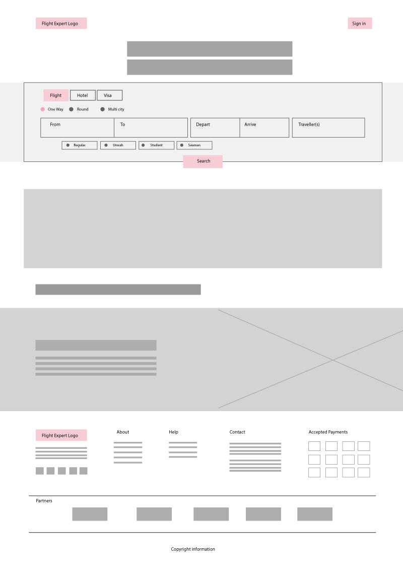
Using Adobe Illustrator, we transformed our ideas into low-fidelity wireframes. These sketches laid the foundation for a simplified navigation structure, clear information presentation, and improved visual hierarchy.
Prototyping and Testing
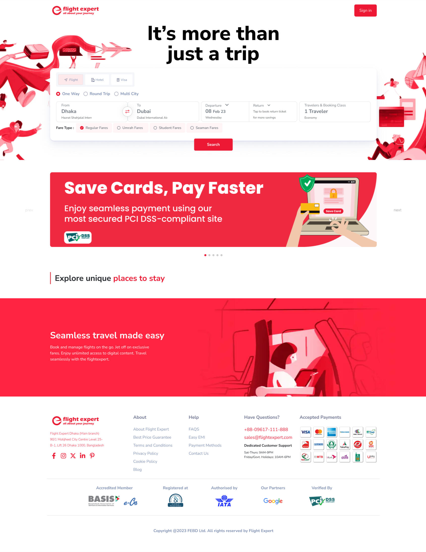
With our wireframes ready, we moved to high-fidelity prototypes. Our designs focused on:- A clean, intuitive interface.
- Detailed service information for transparency.
- Enhanced visual appeal and accessibility.

Homepage

Flight Search Filter

Hotel Search Filter

Visa search filter
Usability Testing
We conducted usability tests in two rounds. The first round, with low-fidelity prototypes, revealed initial reactions and areas for improvement. The second round, with high-fidelity prototypes, confirmed that users found the new design intuitive and engaging. Feedback was overwhelmingly positive, highlighting the success of our user-centered approach
Heuristic Evaluation
A thorough heuristic evaluation ensured our design adhered to best practices, identifying and addressing any remaining usability issues. We have used Jakob Nielsen's set of 10 Design Heuristics. We had 3 Participants, two Designers and one IT professional evaluating the following issues:1. Visibility of system status
2. Match between system and the real world
3. User control and freedom
4. Consistency and standards
5. Error prevention
6. Recognition rather than recall
7. Flexibility and efficiency of use
8. Aesthetic and minimalist design
9. Help users recognize, diagnose, and recover from errors
10. Help and documentation

Flight Search

Hotel Search
User Feedback Integration
We incorporated user feedback at every stage, iterating on our designs to refine and enhance the user experience continually.

Visa Search

Booking
Bringing it all together: Implementation
Our development team embraced Agile methodologies, working in sprints to implement the redesign. Regular check-ins and reviews kept us on track, ensuring seamless integration of design features. Sayem, the in-house designer, skillfully handled the payment method design, following the design system we had established.
Development Process:
1. Sprint Planning: Defined goals and tasks for each sprint.
2. Development: Implemented design features and functionalities.
3. Testing: Conducted regular testing to identify and fix issues.
4. Review: Held sprint reviews to assess progress and gather feedback.
5. Launch: Deployed the redesigned platform in phases to ensure a smooth transition.
Celebrating Success: Results
The transformation was remarkable:
- User Complaints: Issues reduced to below 10%.
- Conversion Rate: Increased by 40%.
- User Engagement: Significant improvement in user satisfaction and engagement.
- Transparency: Users reported a much clearer understanding of flight details and booking processes.
- Accessibility: Enhanced accessibility features resulted in a more inclusive user experience.
Reflection and Learnings
Looking back, the journey was as rewarding as the destination. We learned that:
- User Feedback is Crucial: Continuously gathering and incorporating user feedback was vital in addressing real user needs and pain points.
- Iterative Design Process: Regular testing and iteration allowed for continual improvement and refinement of the design.
- Collaboration: Effective collaboration between remote and in-house teams ensured a cohesive and successful project outcome.
- Agile Methodology: Working in sprints with regular reviews helped keep the project on track and allowed for flexible adjustments.The redesign of Flight Expert’s trip search and booking experience not only resolved critical user issues but also set a new standard for online travel booking in Bangladesh. It was a journey of discovery, innovation, and collaboration, resulting in a platform that truly meets the needs of its users.
Let's Connect!
Feel free to reach out to me if you're interested in discussing potential employment opportunities.


